As you may know there was a recent update to the main website. Please chime in with anything that needs attention.
On the website tab, there’s a small black triangle instead of the normal NB icon:
Anyone else seeing this? I’m on a Chrome desktop browser if that’s important, and the icon for the forums is unchanged.
I agree with @Theodora_Phoenix on the lack of color! First the forums, now the site…
Anyway, I do love the new function that lets you heart names right from the lists. (Before, you had to open the name’s page to add it to your favorites.) I also find the update has fixed the functionality of my account on the main site – I used to always struggle with accessing my lists, etc.
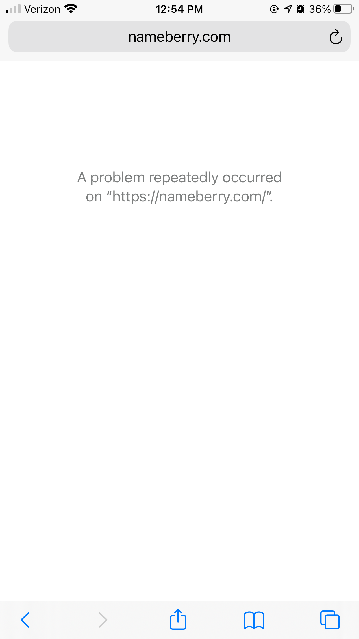
OK, thank you. This particular error message is one I’ve already contacted the tech team about, so hopefully they are already looking into it and working on a fix. Apologies for the inconvenience!
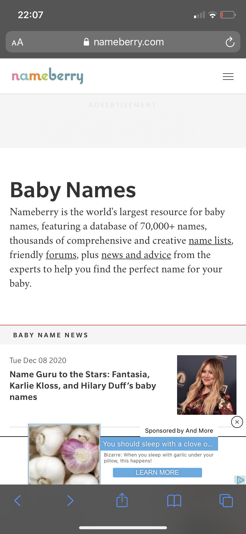
Firstly, the positive!
I think the home page is much, much easier to navigate. I like it a lot!
Some problems I have:
The popularity rank diagram thingy isn’t working. I’m trying to click on specific years to see the name’s popularity at the time and it just won’t let me
I think the famous people and pop culture sections take a lot more space than needed. In the previous format they were more easily accessible and tidier.
This is less of a problem, and more of an opinion. I’m not too fond of the just black and white everything. I miss the fun colours: the green, orange and pink associated with nameberry. This less customized version feels more like it could be any random blog than the website we’ve grown to love over the years, it’s impersonal. I’m also not a fan of the black triangle presented as the tab symbol for the main website. I much prefer the colourful “n” symbol we used to have.
It’s been working fine on my phone (iPhone/safari user!) I quite like it, it feels clean and organized. It is a lot of white, but I don’t mind it too much.
I am having the exact same portrait vs landscape issue.
This is working for me, on mobile too. What device and browser, please?
Yes, some of these are quite lengthy now. Also, is it just me or is it not possible for users to edit these sections now? If that’s the case, I don’t think that’s a deliberate change so I will ask about that.
The new site is much more customisable our end, so this is something I could raise with [name_f]Pam[/name_f] and the other content creators.
I think this might just be a small detail that has been overlooked, but that we can change at a later stage once other more important issues have been dealt with.
I’m sure this info is somewhere, but I’m wondering where the tickertape of searched names went and where the popularity cloud went? And why did they go away?
I loved seeing names on the tickertape and getting a sense of what was being searched.
It works on my Mac, but it just doesn’t look appealing to me. There’s too much empty white space, which hurts my eyes.
There’s nothing wrong with old layout. In fact, as someone else pointed out, the colours they used were nice to see.
Like the old saying goes - “If something’s not broken, don’t fix it.”
EDIT: I’ve also noticed that the comments on individual name pages have been removed. This annoys me, as sometimes the descriptions the editors write are quite harsh and unfair. It was nice to see other people’s opinions and talk to each other about why we like/dislike names.
I’m on Google on my Windows laptop! I tested out a few more names and it actually worked just fine with some but not with others so I’m not sure what’s up.
And to answer your question, nope, I don’t see an option to edit the famous people/pop culture section.
Thanks so much for listening to us and addressing our opinions!
Like a lot of other people, I miss the colors! All the white makes it kinda look like it didn’t quite finish loading, lol. Also, where did the comments on the individual names go?

 I quite like it, it feels clean and organized. It is a lot of white, but I don’t mind it too much.