How To Design Your User Card!

Since user cards are a totally new function for a lot of people, I’ve made this tutorial with screenshots of how you can design yours to best showcase your favourite names! :smiling_face_with_three_hearts:

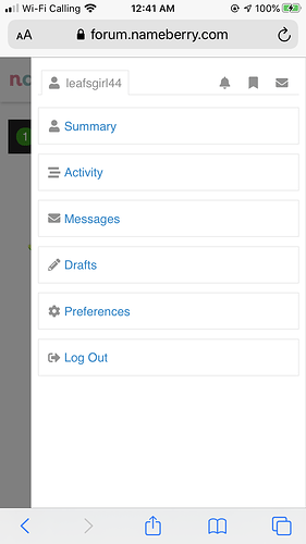
First, to access your user card settings, click on your avatar in the upper right corner of the page. Next, select the Preferences option!

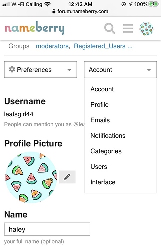
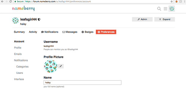
Once you’ve done so, this screen will pop up. To add an avatar for yourself to be seen as on the site, you can do so here where it says Profile Picture! This picture will be seen by all users, so don’t use any images you wouldn’t like to have seen on the internet (such as photos containing personal information!).

When you’ve done so, and are happy with your photo, select your profile to access your user card settings!

This section looks very much the same on both desktop and mobile, but I’ve opted to use mobile screenshots because they focus in on each section a little bit better!

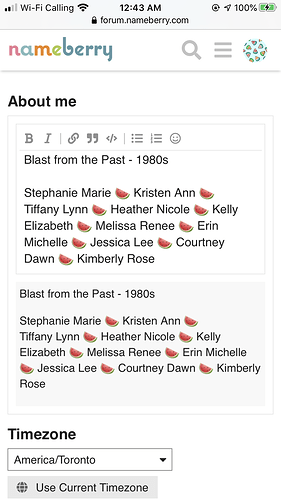
From here, you can add your favourite names in the About Me section! When you do, they’ll appear in your user card for every user to see, much like a signature.

You can edit your About Me text to be bold, italic,

include links, etc., and if you’re like me and opt for a theme, you can even include emojis by choosing the smiling face icon.

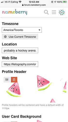
This is also where you can select a timezone, location (you can make up whatever you like here, just please, no personal info!), and add a favourite link (such as a link to your full name list!)!

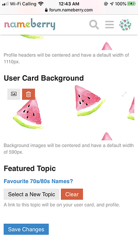
This page also allows you to add a profile header of your choice for everyone to see when they click on your user name and choose to view your profile.

If you’d like to add a little extra flair to your user card, you can add a background for it on this page too!

[name_m]Add[/name_m] a featured topic of yours from the site if you’d like, and when you’re happy with your user card, you can select Save Changes!

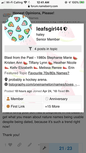
When finished, your user card will look something like this! :relaxed::sparkling_heart:

21 Likes

This will be so helpful to others! Thank you for thinking to make it! :blush:

3 Likes

Thank you! :heart: I certainly can’t take all the credit though, the tutorial was a joint idea/effort! :slight_smile:

2 Likes

Thanks for this super helpful tutorial, [name_u]Haley[/name_u] :yellow_heart:

2 Likes

No worries! Hopefully it helps to make the transition a little smoother! :sparkling_heart:

1 Like

hi! I have an issue with my user card, and thought this would be a good place to ask about it.
I’m sorry, if I should just create a new post, let me know!

I’m trying to update my user card, and I realized that a lot of the features aren’t working for me. I can’t bold, italicize, or use emojis. After I click them, it just uses the code version after I click save (so for italics, it has asterisks around the word, for emojis it just puts colons around the word). It has been working in comments, so I’m not sure why I’m having trouble with my user card. I’m not sure if it’s something I’m doing wrong? Does anyone know how I can get them to work?

Thank you so much in advance for the help!

[name_m]Hi[/name_m] @regionlatbest,

Bold and italics don’t display anyway on the user cards, as far as I know, but emojis should :thinking:

When I click through to your profile, I can see a grey box around your profile information. What exactly are you typing in there, including any punctuation marks, etc.? It looks like you might have accidentally used some Markdown which is causing some unexpected formatting.

ETA: [name_m]Ah[/name_m] yes, I see. It’s the indent you’ve used. The indent is causing your profile info to be rendered like code. If you remove the indent and just left-align and type like a normal post, all your emojis should work fine on both user card and profile page, and any bold and italic formatting will display on your profile page only.

1 Like

@katinka thank you so much for always being here to help! It was my first time using the user card, and I’m more used to the old signatures where I used to indent.
I really appreciate your help! Sorry I didn’t think to try it without the indent!
[name_f]Hope[/name_f] you have a really nice day, thank you again!!

Totally understandable! I believe the user cards left-align and remove bold/italic formatting by default to fit more info on, but much more formatting can be added on the actual profile page.

[name_m]Don[/name_m]'t hesitate if you have any more questions :slight_smile:

1 Like

Hi! I am just a bit confused. The second screenshot doesn’t look like what I am seeing. Could it be because I’m on an iPad? If so, how would I do it? Thanks in advance!

[name_m]Hi[/name_m] there @EllArePea ! :slight_smile: It could be because you’re on an iPad! Are you able to private message me/post a screenshot of what your screen shows? I can talk you through it from there!

1 Like

Never mind! I think I figured it out but thanks anyway! And I will probably be back…

@EllArePea not a problem!! If you need any more help, feel free to message me or comment here again :slight_smile:

2 Likes

Nice! :grin: You deserve the badge!